So much to discover!
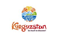
The new (English) logo and slogan
So, it’s now official … or is it?
As I keep reminding myself: This is, after all, Kyrgyzstan – Central Asia – where nothing is as simple as it seems at first … or as an acquaintance once put it: “where anything can happen … and usually does.”
Anyway, according to the posts on various outlets of “social media”, such as Twitter and Facebook, Kyrgyzstan has adopted a new brand, logo and slogan which it will use to try and position itself as a potential destination in the ever increasingly competitive global tourism market place.
The trouble is … that’s not quite the full picture.
I have written before about the various “brands”, images, logos and slogans which have been adopted over the years, (several times, in fact … for example, here and here, top give just a couple of examples), and one might wonder if it is a subject worth another outing so soon after my last rant about marketing the country. However, I think it is worth it, because it raises several questions which I think deserve attention. For example:
First: Who’s slogan is it anyway?
Several of the tweets and social media posts suggested that it was a new official brand, approved and adopted by the government. Others suggested that the Ministry of Culture and Tourism had selected the new iconography for the country. I am pleased to say that the press reports, (at least most of the ones that I saw), actually did quite a good job and represented the background quite well.
There hasn’t been an official concept for the development and marketing of tourism since the previous plan lapsed in 2010. Well, back in 2010 our minds were concentrating on other, more immediate, issues … and since then it was difficult for anyone to gather up steam to tackle anything but the most urgent of problems.
That’s not to say that nothing was done – just that little seems to have been achieved. At that time, the responsible government body was the Ministry of Economy and Regulation, and they did try to set in motion the processes … but it was a difficult time to do anything. It would be harsh to say, or even hint, that they took their eyes off the ball, yet alone dropped it, but it is easy to see why some people may be tempted to think so.
In the meantime, however, several of the international donor organizations decided that they wanted to do something to help and one project in particular, (financed by the European Union and implemented by ESCEAT - based in the Netherlands – IBC, KATO and KCBTA here in Kyrgyzstan together with tour associations in Tajikistan and Kazakhstan). took up the reigns. In discussions with the Ministry it was agreed that they would work on developing a brand, and associated imagery and a number of other things such as the development of an official website.
Please note: “and a number of other things” … this is just one of a whole package of measures which on their own might seem like “small beer” but when taken as a whole, as a package, should help us to actually achieve something that will help tourism to develop within the republic. I am worried that, without some form of help, we would continue floundering around – not because Kyrgyzstan lacks the knowledge skills and experience to implement such innovations, (it doesn’t, it has them in abundance), but because it lacks the incentive, focus and consensus to do so.
Anyway, since then, the structure of government has changed and the responsibility for affairs relating to tourism passed to the newly created Ministry of Culture and Tourism.
We need to bear in mind that this is not the first time that these tasks have been undertaken, nor that there is a historical and global context. The project team worked on collecting information about other exercises, both in Kyrgyzstan and abroad … inviting suggestions for themes and images and a commission was established to consider the various proposals. Unlike some other occasions of which I am aware, they had a wide variety of suggestions to consider and, although I wasn’t on the commission, I understand that they had quite detailed and heated discussions. Of the various proposals, one was selected and that’s the one being presented to the public at the moment.
However, as far as I am aware, it hasn’t yet been “officially” approved and adopted … and, in fact, that’s quite a complex process. If the Ministry of Culture and Tourism wanted to adopt it for it’s own internal uses then I suppose it would be free to do so but if it is an official brand for Kyrgyzstan as a whole, then there are lots of other interested parties, departments and agencies of the government, who have to be consulted. Only then can a decision be made and accepted.
At the moment, it’s nobody’s brand, logo and slogan … except, perhaps, that of the commission … now it is being presented to the Ministry for consideration. Oh, the bureaucracy (!) … but there is a logic to it.
To make matters worse, we are now in another of those moments when everything seems to be in the process of change … will the same people that are serving in government today be there tomorrow … or will it be someone else who decides that they want to make their own mark … and that they can do better.
Second: Who’s happy with it?
There is still a possibility that it could be rejected, if there will be sufficient opposition.
I wasn’t a member of the commission, but I understand that they considered a wide selection of different suggested designs. It wasn’t a case that the “customers” sat down with the “design experts” who listened to their instructions, and then produced a design – or even three alternative designs – according to their brief.
Now, let’s face it … with so many alternatives, there were bound to be a number of disappointed people, (those, for example, who submitted or voted for a different design). Indeed, criticism is easy – easier than the creation and justification of an alternative. What’s more, it is hard to imagine any design as being “perfect” without any problems or drawbacks. I did see one criticism which said that the writers objections to the design were objective, principled ones … and therefore, by implication, not subjective or based on emotions. As it happens, I had some sympathy with the author’s comments but, on balance, I think it is not a bad choice.
- It does seem to be “busy”, complicated, difficult to reproduce or copy, for example … but that doesn’t seem to me to be a major problem, indeed it adds an element of intrigue to the design.
- It is simple in that it is a basically a circle.
- In terms of attractive, bright, colourful and will be recognizable.
- Most of the elements are symbolic and draw on traditional Kyrgyz motifs, portraying a lake such as Issyk Kul and the mountains, petroglyphs and even a letter “K”.
- Although, most of the colours are not traditional Kyrgyz colours, they are bright and cheerful and should appeal to a wide variety of people regardless of age, socio-economic or cultural background. They make an interesting compromise between the relaxing pastel colours that are suggestive of Sun, Sand, Sea type of vacations and more active Adventure holidays.
Yes, I suppose it would be possible to do better, (isn’t it always?), but it’s not a bad effort and worth at least a”B+”, (or a “4″, on the local scale of grades).
No matter how good it is, however, we also need to recognize that it won’t be perfect. It is a symbol, (just one symbol), for the here and now, (… and the immediate future … ideally it will work for several years), but it may still be necessary to consider adaptations or “variations on a theme” to meet particular circumstances.
Third: What’s the aim?
An obvious part of the answer to this question is to attract attention and, hopefully, entice people to think of Kyrgyzstan as a possible destination for their holiday. In addition it should serve as a mark or symbol that can be used for identification purposes – hopefully creating a badge of quality.
I have already commented a little on some of the choices encapsulated in the design, especially in the choice of colours. Another example can be found in the slogan “So much to discover!“. Now, I quite like that … although it is a lot better than it was seventeen years ago when I came out here, it seems to me from all that I see and hear that there are still far too many people that have absolutely no idea that there is place called Kyrgyzstan, yet alone where it is or anything about the the history, geography, landscape, wildlife, culture or any other aspect of the place, the people who live here or the lives that they lead. This slogan is powerful in declaring, “There IS so much to discover …” and at the same time it contains a hint of an invitation “… come and discover it with us!”
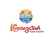
The new (Russian) logo and slogan
(Actually, I have to come clean and say that there are really two slogans … one in English and in another in Russian. The image chosen for the logo is the same, but the Russian slogan translates, “Strana Otkrytiy” thranslates as “Country of Discoveries”.
Although I am told that this works well in Russian, a country where there are things to be discovered (like there are opportunities to be taken in a “land of opportunities”), but there’s also a slightly different emphasis which I understand to be like “A wonderful country”, or “Enigmatic Country”.
Fourth: Will it be effective?
When faced with questions like this, I always feel a great temptation to be mischievous and answer something like: “Who is John Galt?”, or “How long is a piece of string?”.
It seems to me that there is a great temptation to think of a brand with its attendant logo and slogan as an end in itself. If it is merely a “tick box” to indicate a “deliverable” outcome which can be objectively observed and measured in some plan or project evaluation … then by all means, “tick the box“. It has indeed been “delivered“. The trouble is that we don’t live in the “Field of Dreams“, where a disembodied ghostly voice can confidently predict that “If you build it they will come …” and the director can pan out in the final dénouement to show this forecast being fulfilled. Let’s face it, we don’t all have supportive guardian angels like Ray Kinsella and, after all, he could just as easily lost his farm, (as brother in law was predicting), as a result of turning his fields in to a White Elephant baseball diamond.
I suppose there are some things that have proved to be a natural success, but generally, in real life as opposed to the movies, initiative and innovation require work if they are going to bring results.
Fifth: What next?
Developing and adopting a new brand, logo and slogan … is Great! … Super! … but having done this it would be a mistake to rest on our laurels and expect them to work on their own. Now, (or, at least, as soon as they are finally adopted), they have to be put to work!
That is going to require Time, Effort and Money.
I am reminded of two piece of advice … one that I was once given by a sage old man: “Use it, or lose it“, (if you have something that is supposed to be useful, then use it or risk discovering that when you really need it, it doesn’t work), and the other: “If you’ve got it, then flaunt it!“. (If you have have something to be proud of, then make sure that people know about it.)
A brand, logo or slogan is only useful, recognizable, help to attract potential visitors and identify Kyrgyzstan and Kyrgyz tour products, if we “get it out there” in front of people. That means we have to use it … for example, tour companies like us need to use it in our advertising copy, on our letter heads, on our websites … but also, we need to use try and see that it is used at exhibitions, in advertisements, posters and video clips … to have it displayed in embassies, hotels, restaurants, museums and any place where tourists might venture. It can be used as the basis for road signs, giving directions and tourism information in and around the country. We also need to have if emblazoned on badges, T-shirts, hats, umbrellas, notebooks, pens, coffee mugs and all sorts of object d’art.





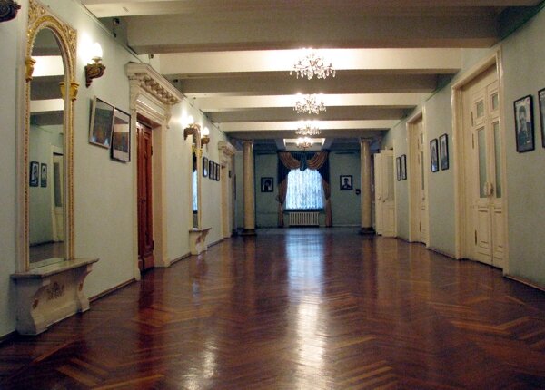
 Bishkek
“Bulgaria’s already controversial new logo designed to promote travel to the country has been found to resemble the counterpart emblem recently developed by Kyrgyzstan.”
http://www.novinite.com/view_news.php?id=147779
… I wonder if the designers all studied together or from the same textbook – or maybe it’s an example of “great minds think alike“.
What do you think?