The Celestial Mountains logo

I keep getting questions about the Celestial Mountains Logo. Some people like it – “it’s simple and easily recognizable” … others don’t – “it’s too complicated” they say.
It is has been suggested to me that a plain white stripe would be better than the more complicated design that we have at the moment.
Well, everyone is entitled to their own opinion …
As it happens, this logo wasn’t exactly our first choice … we obviously thought about a logo and corporate style.
 One early suggestion, from the person who designed our original (very small) website, involved a photograph of mountain peaks. Although we liked it very much, it looked “cold” and appeared cluttered with too much detail which meant that it wasn’t very clear, unless seen on a large scale. We also wondered if it would “date” – especially as we had chosen to use an Old English Copperplate font for the title.
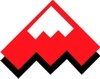
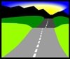
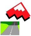 We looked though various catalogues, clipart collections and other sources for inspiration and eventually came up with a number of designs that we quite liked and we handed them to a marketing consultant and his designer. One of the designs was very similar in shape to the existing logo and we quite liked that because it looked like a mountain peak. A second option involved a road heading towards some mountains in the distance. We also thought of trying to combine them in some way into a sort of collage.
Well, the designer set to work and came up of different alternatives – the present logo being one of them.
The shape of the logo in the form of a triangle clearly suggests a mountain peak – especially with the small white copy inserted at the peak – and he suggested that we keep that. The mass of vibrant red however, appeals to and implies both youth and activity and that wasn’t exactly who we had in mind as our potential clients.
He explained that he had chosen the colours, red white and blue, for a number of reasons.
- they are youthful colours, appealing to and implying activity; however,
- they are also fairly neutral colours – and are used on a variety of flags, Britain, the United States, Russia, France, Holland … and so would not be “off putting”
- the blue represents the sky, the red the earth and the white stripe represents both snow capped peaks and a road.
The designer went to outline his thinking behind the “bent white stripe” in the middle of the design. He wanted to symbolize a road, with serpentine bends, snaking through the mountains. The fact that it suggested mountain peaks, and also looked like a letter M. made it a powerful motif. The triangle forming an arrowhead was to symbolize direction and movement and, so he said, was inspired from one of our original mottos or slogans: “We’ll take you there!”.
In fact, quite a few people seem to assume that it is meant to be a letter M, for Mountains, and some even ask “What happened to the C for Celestial?”
As an aside:
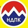
During the recent election campaign, Artur, (one of our staff), came into the office and took out his mobile phone. He showed me a photograph he had taken with if of a lamppost not far from the office. “So what?” I asked. He said, “Look closely.” On the lamppost was a number of flyers posted by different parties contesting the election. One of them looked a little familiar.
There were the mountain peaks … there were the colours: red, white and blue … yes, there were differences … but, all the same, it looked familiar.
Yes, well, it was nothing to do with us … and nobody seems to have made the connection.




 Bishkek
On a similar theme, I came across this today: http://www.truekolor.net/20-best-logos-with-hidden-meaning/
There are some other fascinating posts on the same site … well worth a look!